
We work to change practices, structures, and policies to realize transportation equity for commuters in San Mateo County.
Commute.org is committed to and accountable for advancing diversity, equity, and inclusion in all its forms. As a public agency serving a diverse community:
Integrating equity principles across all programs is one of Commute.org’s strategic objectives for the 2025 Strategic Plan. The agency uses this data to better understand where the gaps are in services.
Commute.org focuses on people who live OR work in San Mateo County.
Much of the information that we have is from the US Census for residents of San Mateo County. It is more difficult to find demographic data for people who live outside the county and commute in.
In addition, much of the data for Commute.org’s programs is based on survey responses, so it is only a slice of the total people that the agency serves and is not comprehensive.

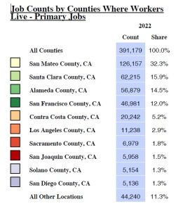
There are almost 400,000 people who work in San Mateo County.

Source: US Census

Source: US Census

Source: US Census


Source: US Census, 2021

Source: US Census, 2022

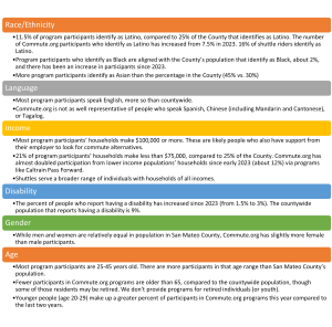
ACS has a separate questions for Hispanic, Latino, or Spanish origin versus Race. Commute.org combines this into one question in which people can select multiple/all that apply.

ACS: English = those who speak only English and those who speak other languages and speak English very well
CommuteStar Demographic Survey Data includes people who speak one or more language, each language counted once

ACS only offers male or female as options


Source: 2022 ECNVY Business Patterns County Business Patterns
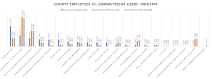
Source: 2022 ECNVY Business Patterns County Business Patterns